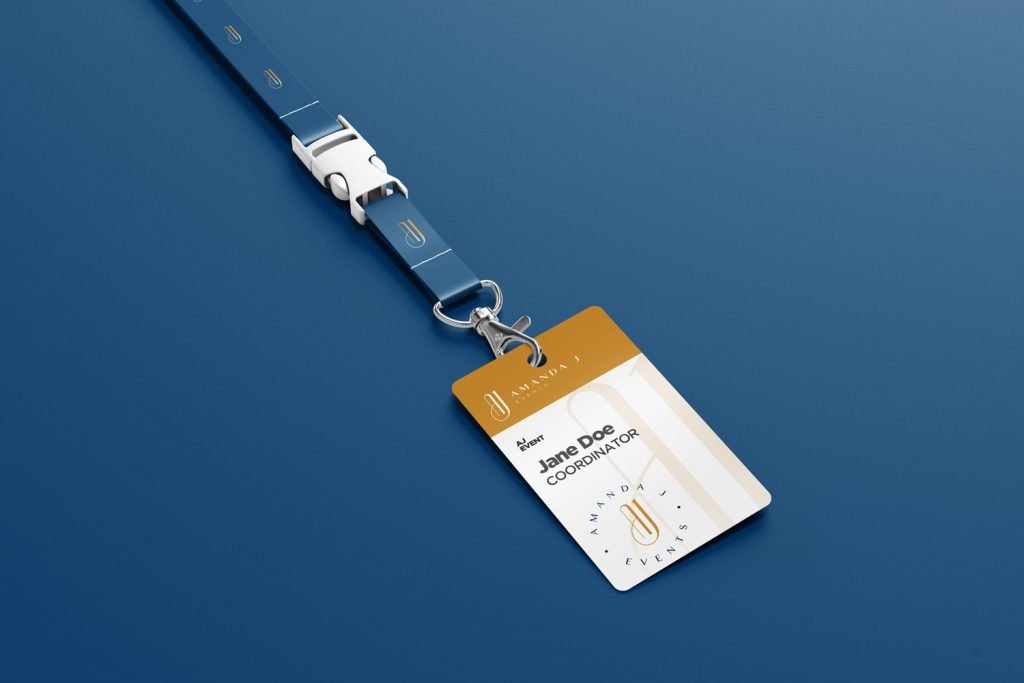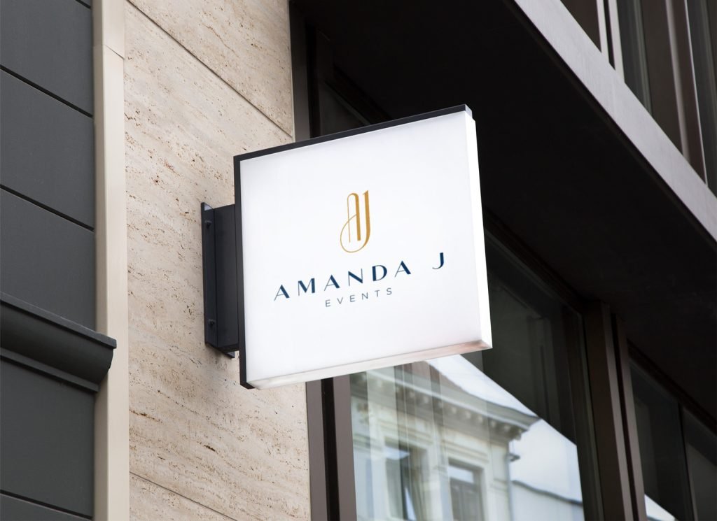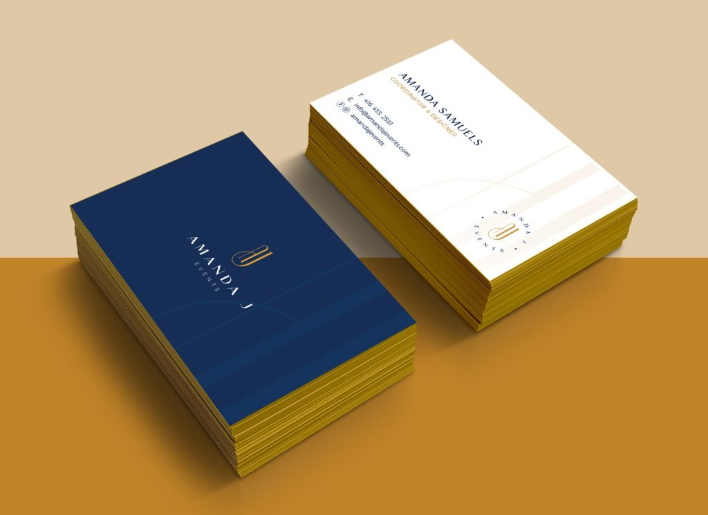
What We Delivered
Branding
The Brand
With a high focus on weddings and corporate events, Amanda J Events is an event planning brand centered around bringing its clients’ visions to life, while creating an unforgettable experience for the client to enjoy.
The Brand Identity
The Amanda J Events logo was designed to speak primarily to the modern day strong woman. An AJ monogram was used as the lettermark to represent ‘Amanda J’. The style and feel of the lettermark is strong in its boldness yet gracefully elegant and chic with its smooth curves.
The typeface chosen creates the perfect marriage between beauty and brains as its serious and corporate feel allows the logo to speak to both the corporate and creative worlds it will live in.
High-End
Unforgettable
Elegant


The Colour Palette
The colour palette of the brand is made primarily of a navy blue and gold. Together these 2 colours help to symbolize and psychologically reiterate some of the brand’s character traits. Aesthetically, the marriage between the colours is perfect, creating an unforgettable and subtly luxurious viewing experience.
Navy Blue
RGB: 0.59.105
HEX: #003b69
CMYK: 41% 18% 0% 59%
Gold
RGB: 192.131.40
HEX: #c08328
CMYK: 0% 24% 60% 25%
Dark Blue
RGB: 16.55.95
HEX: #10375f
CMYK: 31% 16% 0% 63%
