Rebranding
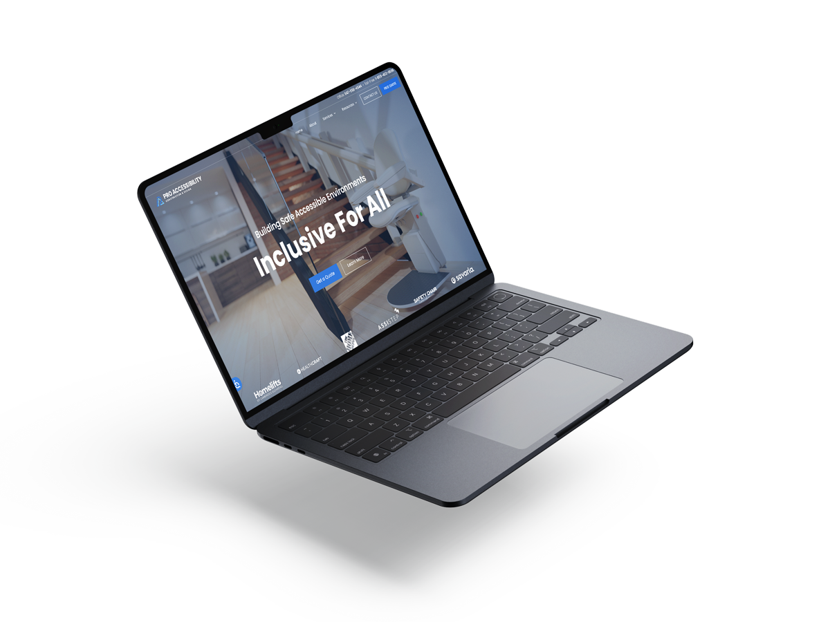
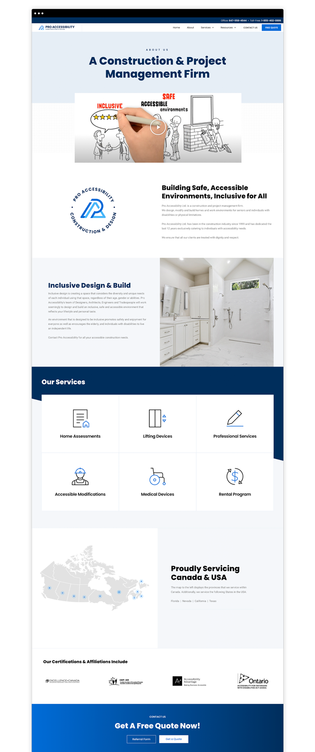
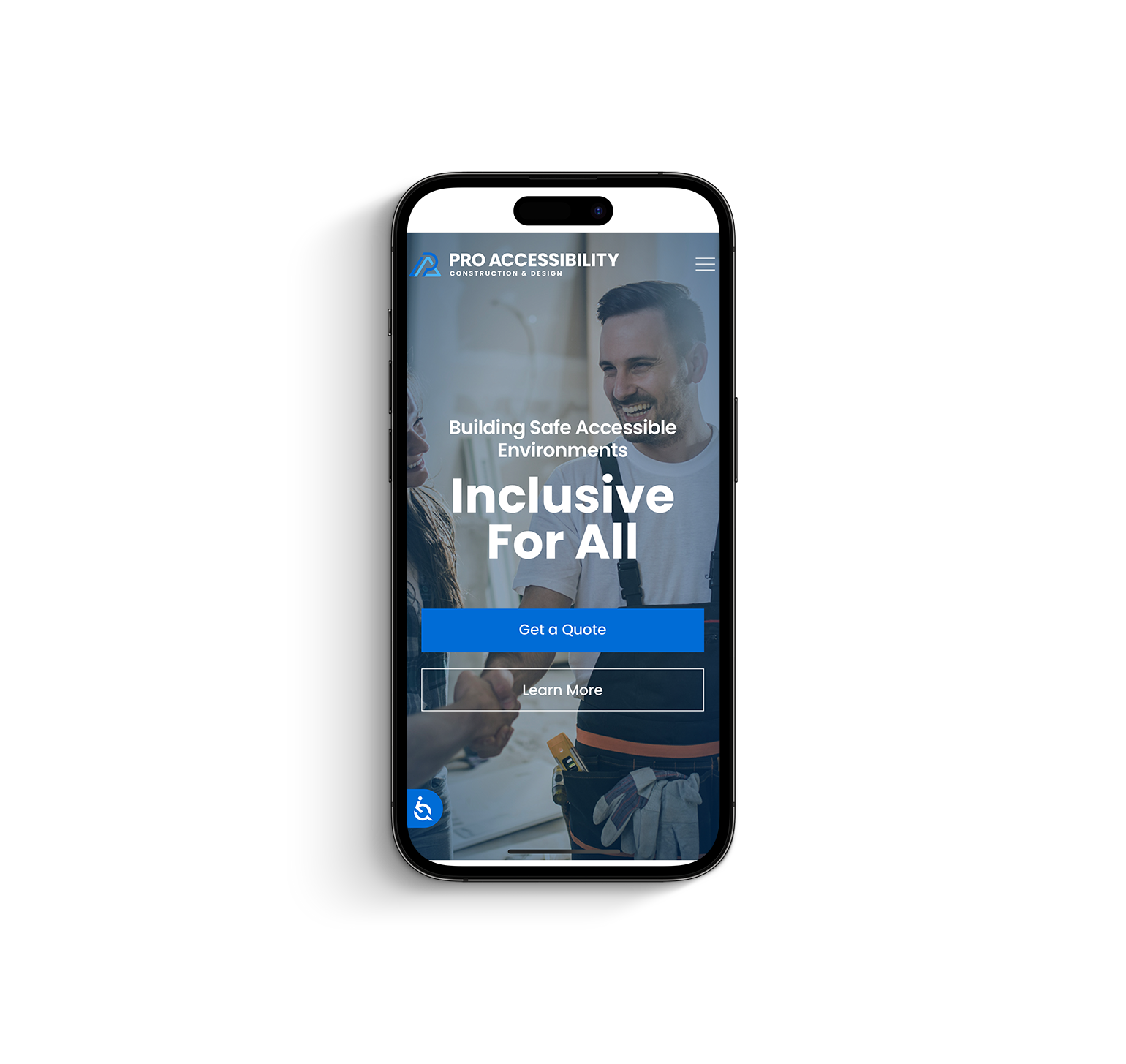
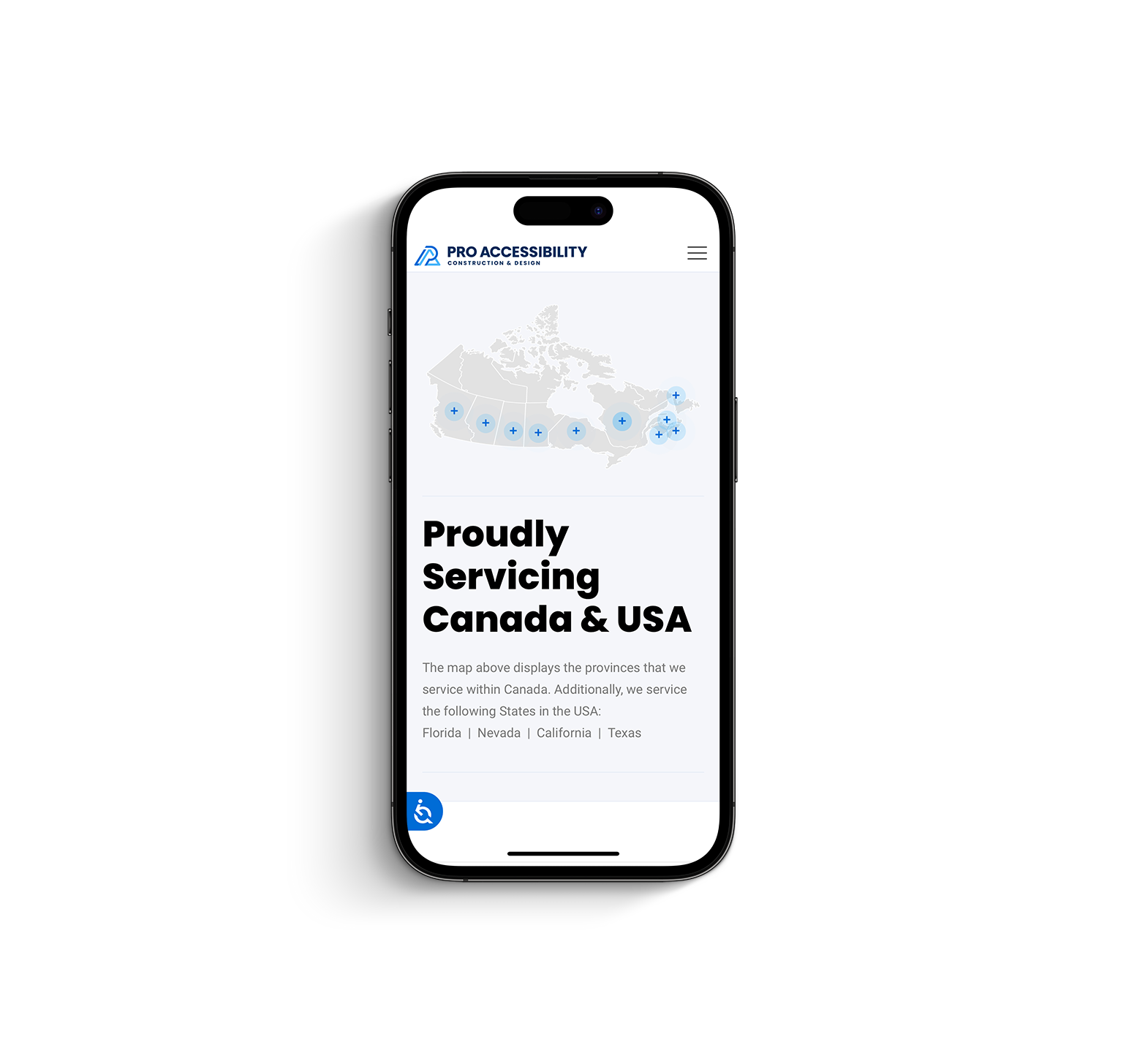
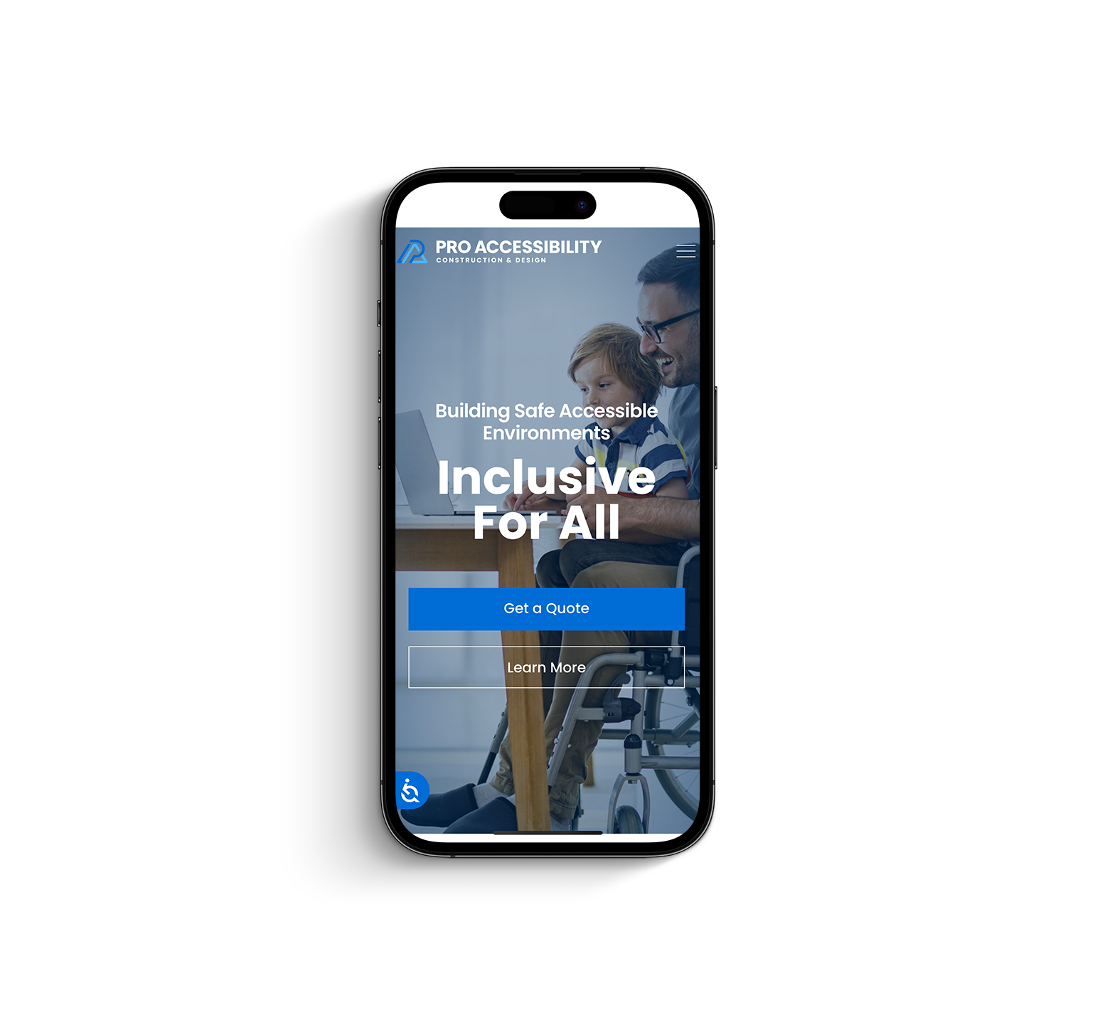
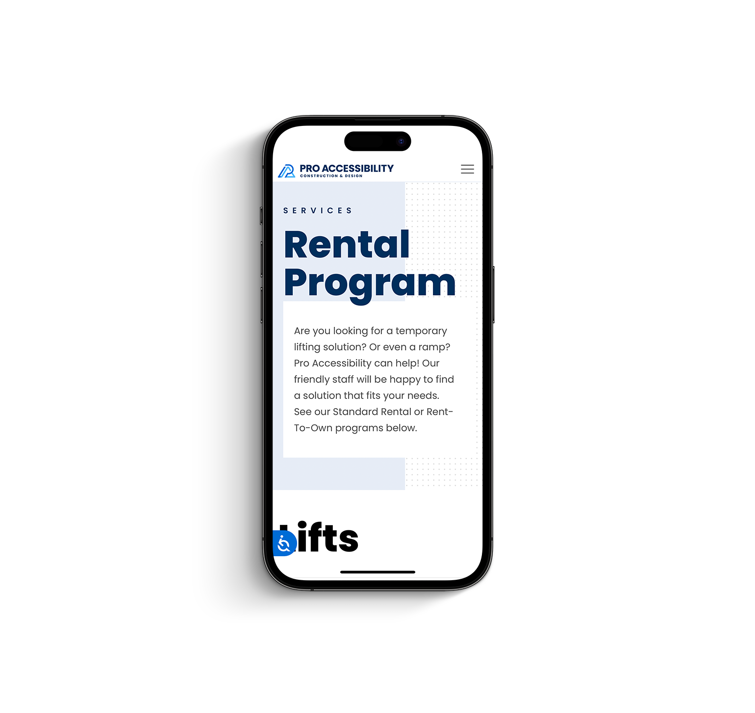
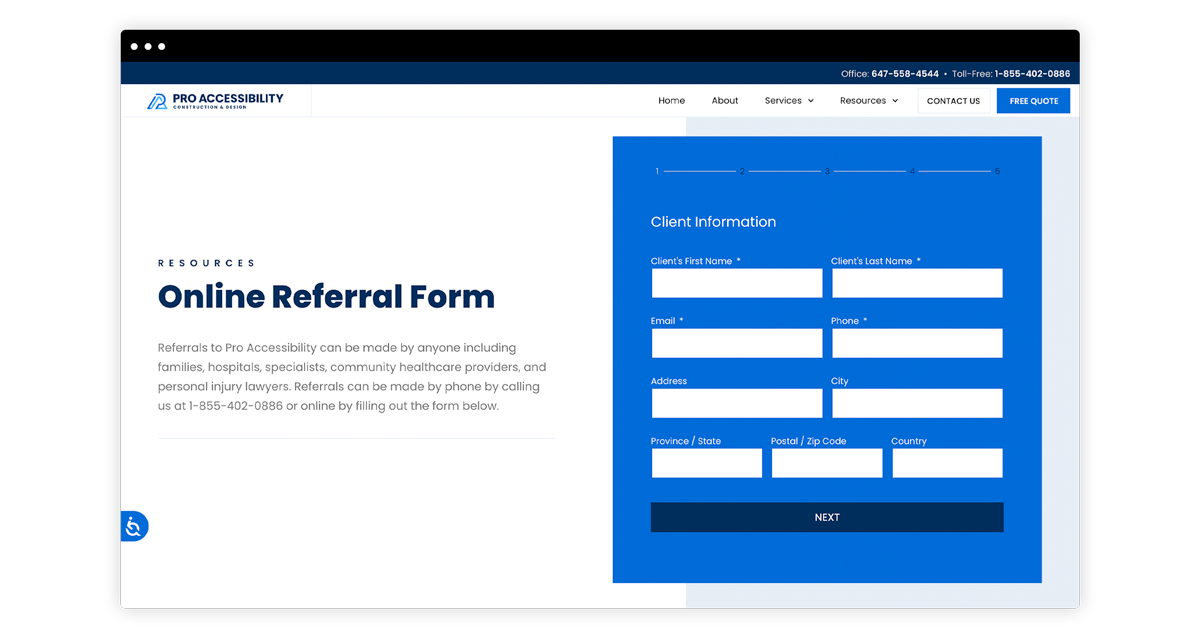
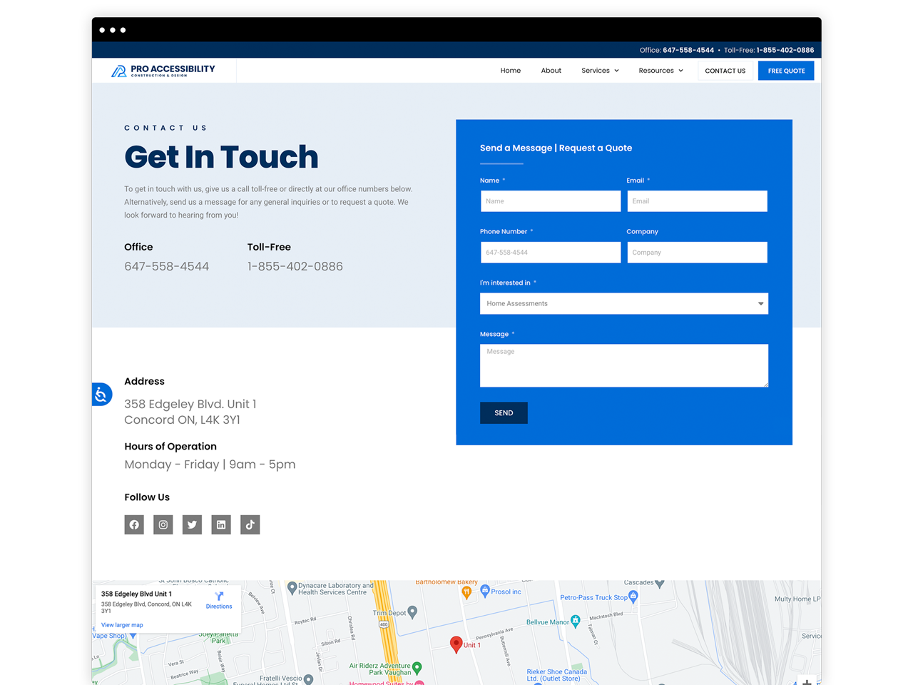
Website Design & Development
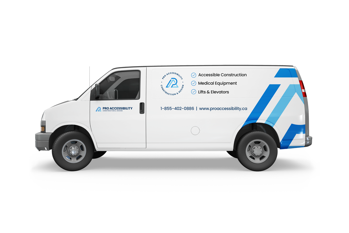
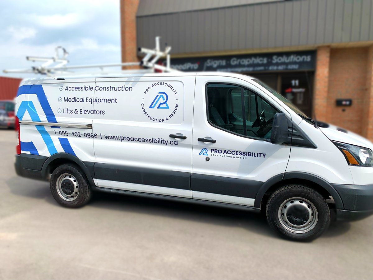
Print Design
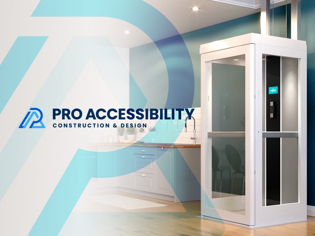
Pro Accessibility Ltd. is a construction and project management firm. They design, modify and build homes and work environments for seniors and individuals with physical and or mobility limitations.
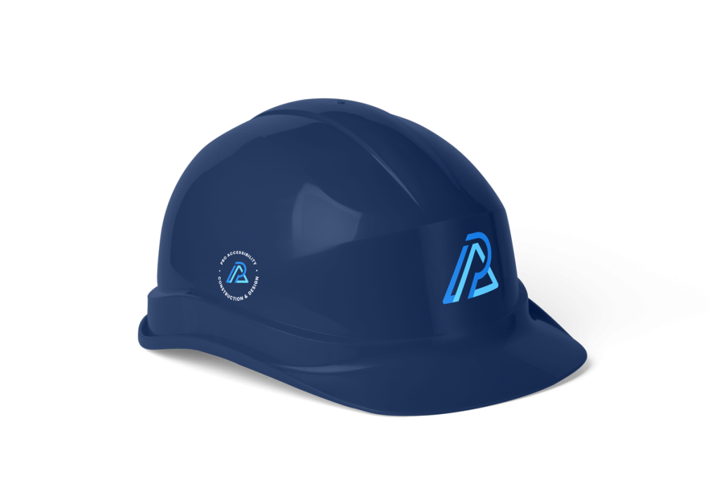
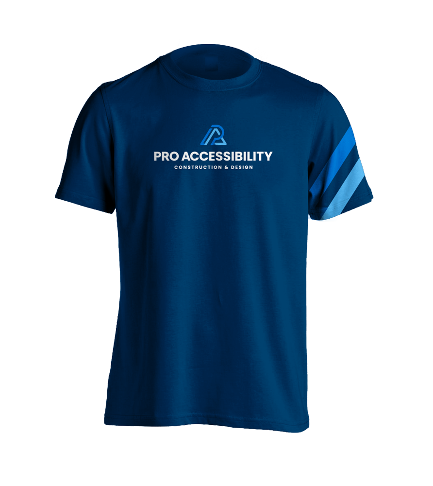
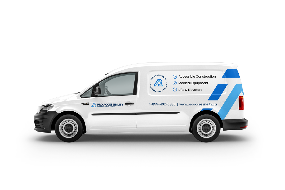
The Pro Accessibility logo was designed to embody two of the main values it provides its clients – mobility and structure. Angled lines were used to convey movement and mobility while the strong bold lines along with the letter ‘A’ represent structure. All in all, a ‘PA’ monogram was used to add individuality and character to the logo that will better be suited to represent the brand Pro Accessibility.

RGB: 153.102.51
HEX: #996633
CMYK: 0% 20% 40% 40%
#4ab6fc
#ffffff
#006cd8
#002e5c
#000000








British Columbia
Alberta
Saskatchewan
Manitoba
Ontario
Québec
Québec
New Brunswick
Prince Edward Island
Nova Scotia
Newfoundland & Labrador
All Work © Spade Designs 2023. All Rights Reserved Spade Designs.